This product is based on five minutes documentary on Graffiti. We chose this topic as graffiti is a controversial topic surrounding media and people of today. Everyone has a right to think what graffiti is? and all of their point is true, as graffiti can be seen as art, vandalism and political free speech. As one of our audience has quoted that if graffiti is made in public property, it is vandalism whereas the graffiti of Banksy is both art and political.
I have used codes and conventions in my product which fits within the art genre. The documentary introduces its cinematography differently. There is only one way of framing interview and that's following rule of thirds. It s important to frame interview properly because it grabs the audience attention. I also researched and watched similar products to get better understanding of product.
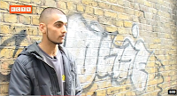 As a cameraperson I tried hard to ensure all the interviews were framed correctly, which was a very hard job. I have followed rule of thirds throughout the documentary except for 1st interview. This is the image of interview with Haroon Singh which I grabbed from my final product. It was my 1st time framing the interview so I panicked. I tried to follow rule of thirds but I couldn't as I didn't know how to frame it correctly. The framing was incorrect as the audience can't see interviewee's face properly and as the location was outside, interviewee was looking around and turned his face towards camera several time. It would be confusing and distracting for audience as framing is not engaging. I liked his interview personally as he has said lot about graffiti and I wanted to interview him again but couldn't contact. The mise-en-scene within the shot relates to product's topic.
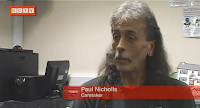
This is the image of Paul Nichols who is a caretaker of primary school, he is engaged with graffiti as kids scribbles on desk which is also a form of graffiti. I grabbed this image from my final product as interview was framed correctly and has followed rule of thirds. I had to look at the image of correct way to interview to ensure framing was correct. The framing is engaging and appealing to audience as images effects the audience view.
 This is the image of Adam Wint, arts student which I grabbed from my final product. This image is also framed correctly as it has followed rule of thirds and the image is clear and engaging.
The cutaway was related to final product as graffiti's shown in most of cutaways. The cutaway ensured that the product could be more engaging and approachable. The cutaway was not limited to use any specific framing, we were free to choose any style of framing.For cutaway we used cinematography of different shots and angle. For cutaway, I mostly used long shot, medium close up and pan of graffiti walls. The cutaway was also linked with voiceover so that audience could relate voiceover with cutaway. The voiceover presented the product as being informative and formal. It helps audience to understand how the product is flowing limiting on its topic. It engages audience both visually and audibly.
For some information which could not be supported by cutaways I used simple texts to convey audience. To complete my product I stayed within codes and conventions of real media product, it can be seen as the overall product was related to topic only.
 As a cameraperson I tried hard to ensure all the interviews were framed correctly, which was a very hard job. I have followed rule of thirds throughout the documentary except for 1st interview. This is the image of interview with Haroon Singh which I grabbed from my final product. It was my 1st time framing the interview so I panicked. I tried to follow rule of thirds but I couldn't as I didn't know how to frame it correctly. The framing was incorrect as the audience can't see interviewee's face properly and as the location was outside, interviewee was looking around and turned his face towards camera several time. It would be confusing and distracting for audience as framing is not engaging. I liked his interview personally as he has said lot about graffiti and I wanted to interview him again but couldn't contact. The mise-en-scene within the shot relates to product's topic.
This is the image of Paul Nichols who is a caretaker of primary school, he is engaged with graffiti as kids scribbles on desk which is also a form of graffiti. I grabbed this image from my final product as interview was framed correctly and has followed rule of thirds. I had to look at the image of correct way to interview to ensure framing was correct. The framing is engaging and appealing to audience as images effects the audience view.
 This is the image of Adam Wint, arts student which I grabbed from my final product. This image is also framed correctly as it has followed rule of thirds and the image is clear and engaging.
The cutaway was related to final product as graffiti's shown in most of cutaways. The cutaway ensured that the product could be more engaging and approachable. The cutaway was not limited to use any specific framing, we were free to choose any style of framing.For cutaway we used cinematography of different shots and angle. For cutaway, I mostly used long shot, medium close up and pan of graffiti walls. The cutaway was also linked with voiceover so that audience could relate voiceover with cutaway. The voiceover presented the product as being informative and formal. It helps audience to understand how the product is flowing limiting on its topic. It engages audience both visually and audibly.
For some information which could not be supported by cutaways I used simple texts to convey audience. To complete my product I stayed within codes and conventions of real media product, it can be seen as the overall product was related to topic only.
How effective is the combination of your main product and ancillary task?
Ancillary task was made to establish and promote the product to attract the audience, which leads to success. It needed to be simple and engaging to make people understand and approachable. We made two ancillary tasks: newspaper advertisement and radio trailer. Newspaper advertisement was the cheapest way to reach our mass audience and promote product where as radio trailer was the easiest way to reach the target audience on and off peak.
The ancillary task assisted my documentary as an important piece related to my topic and shared information for the audience. I also developed through research of similar media to complete my tasks. It was important to add date and time clearly on both tasks to inform audience correct dates.
Fig 1
Fig 2
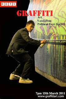 For my newspaper advertisement, I uploaded an image and edited it in Photoshop. I made two-advertisement fig 1 and fig 2, from which fig 2 is the final draft. The construction of fig 1 was a high-class man making a graffiti by hiding it under the newspaper which connotes as a sensitive person. Although he likes to make graffiti, he is scared of the society and law. I didn't like this advertisement as spray can is hidden and hole in the newspaper is not seen clearly; it looks like he is really reading a newspaper in front of graffiti. So, I decided to make another advertisement, which is fig 2.
The construction of fig 2 is an artist trying to run away after someone sees him making graffiti. The suit connotes that he is from a high class. Usually high-class people doesn't like graffiti as it is a sore to the eye. I have attached the logo and date in my advertisement so that audience could easily know where and when the product is released. The typography of the title is big, bold and red in colour to draw attention from an audience. The colour red connotes danger.
For my radio trailer, I wrote a script to structure it and quote the interview of interviewee. For narrating the trailer, I chose Andy as he has a masculine and clear, understandable voice. I gathered music off hip-hop and jazz score music that could go within the art genre. The score music created a new meaning for my radio trailer. It made easy for the voiceover to start and engage the audience. However, this was essential to my main product as it helped audience to understand the product. I recorded a voiceover of Andy and also included the audio from my product and edited it in the Final cut pro which grabs the attention of the audience. I chose the audio of art teacher Jenny, as her point of view is different. Jenny thinks its all of them as all the views are true. The voiceover was clear, formal and understandable for audience to understand. While creating my radio trailer I had a clear image of my target audience and focused on the conventions they would expect.
The ancillary task assisted my final product as it promoted my product conveying its message to the audience.
What have you learned from your audience feedback?
After making this product we took an interview of three audiences for feedback as it helps to improve our product. The audience we interviewed were age group between 18-30. The audience commented on the strength and weakness of the product. It was 1st time for our audiences to watch documentary on graffiti so they really enjoyed watching it. They also mentioned that the documentary was very balanced and informative. They also suggested improvement for the product, someone mentioned that it would have been better if there were more interviews, whereas someone suggested it could have been better if the music was different. I learnt that the images have a very significant effect on audience as these helps audience to get better understanding of topic.The audience ensured that product was enjoyable as different element included was expected to see on documentary. Their opinion was informative as I need to keep the audience entertained.
I found it encouraging and motivating as I learnt that I still lack some skills but still have a chance to improve in future. I also learnt that it is essential to keep the audience entertained throughout the product.
How did you use new media technologies in the construction and research, planning and evaluation stages?
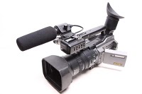 We used different technologies to make and present our work. The main technologies that we used are the software of the computer and camera equipments. My role was a cameraperson so I was in charge of camera equipment. I had learnt to use camera equipments last year so it wasn't very hard task. It was easy to set up the camera and tripod. I also used "DV Tape" to capture the shots. The tripod allowed us to frame accurate shots so the camera won't tilt, most important thing to focus while filming was bubble. The bubble had to be in middle for every shots so that the frames are in steady level. I was also familarised with other equipments like NP-F970 Battery, tie-clip microphone, headphones and VX cable. These equipments constructed different stage of my product as it produced high qualified output. While planning the documentary we used different documenataries to analyse and expanded the knowledge to potray media technologies.
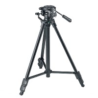 During filming I found it quite hard to film accuarte shot as it was different from filming a movie. I shot wrong frames and had to shoot it again though I knew I had to follow rule of thirds. It took me time to folow rule of third but after parctising for a while I found it comfortable and ensured it was framed correctly.
The software I used during research, planning and evaluation are
 Blogger: I created blog to store my personal and group work. It was easy to use as I had used blogger before for AS media. Uploading work and hyperlinking was also simple as blogger has improved its version.
  Photoshop: To edit our newspaper advertisement we used photoshop which was time consuming. It took more time than I thought to make my advertisement, though photoshop was easy to use once we have knowledge.
Finalcut Pro: Although I was a camera person I had to use Fianlcut pro to edit my radio trailer. It allowed me to add music and construct the steady volume level.
Powerpoint: Powerpoint was used to make chart of audience feedback, the chart helped us to know audiences interest on documentaries.
Scribd:
Scribd helped us to save and upload document on our blog. It helped us to present our blog better.
Youtube: It helped us to search similar media products and get the ideas of framing the documentaries, which made us easier to learn the correct way of framing the documentaries. We also uploaded our product and audience feedback on youtube. It was easy to use this website as this is the most popular website now-a-days.
Google: It helped us with secondary research. The idea of newspaper advertisement and article of similar product was researched through google. Most of the information for similar product was produced through google.
Bubbl.us: It helped us to construct our idea.
I watched several documentaries which allowed me to establish accurate framing techniques and became more confident to use it.


